Your Maker Booth Preview
Please create your maker booth preview entry for our online booth preview promptly. (You need to be logged in to access the maker booth preview creation form.)
Maker booth previews are a big part of how the volunteer organizers market the Market — so be sure to do your part to bring in shoppers and create your maker booth preview ASAP!
You will need to be registered and logged in to access the booth creation form. If you can’t access the form, then you need to let the organizers know.
How to write a Maker Booth Preview
If you’re feeling daunted by the idea of writing up a Maker Booth Preview, start by answering the following questions. Then take your answers and put them together into a paragraph (or two):
- What is your age?
- Is this your first Makers Market?
- If not, how many Makers Markets have you participated in?
- How many years have you been homeschooled?
- Do you have any favorite hobbies?
- What will you be selling?
- What are the materials you use to make your products?
- What are some of the steps you follow to make your products?
- How long have you been making this product? Or how old were you when you first learned this skill?
- How can your products be used?
- Who will find your products the most useful?
Your Maker Booth Logo
 Your square Maker Booth logo can be anything you like, but if you’re stumped, some ideas are …
- a photo of something you made
- a photo of you making something
- a photo of you with something you made
- a photo of you
- a graphic you designed (or purchased)
- the name of your booth is a nifty font
Please ensure that you have the right to use any images you choose. (If you took the photo or created the image, then you have the right to use it. If someone else did, then you need to get their permission to use it. You may also need to pay them a small fee to use the image.)
One place to look for ideas is the The Noun Project. Type in a keyword and see what other people think that concept looks like. You can then use that inspiration to create your own image unique to you or you can purchase the The Noun Project image to use.
Adding images
Use images to show and sell!
The process for adding images is not intuitive, but it is explained in detail on the form.
If you have any problems, please just upload your images and then send an email to the volunteer organizers asking for help getting them added to your Maker Booth Preview.
If you have trouble uploading images, then please email them to the volunteer organizers and ask for help getting them uploaded.
About images and social media
You’ll also be asked to specify an og:image for your Maker Booth Preview. The Open Graph protocol allows Facebook to identify the right information on a webpage when it is shared by Facebook. (Other social media also use the Open Graph protocol, but it was developed by and for Facebook.) HomeschoolRecess will provide a lot of the og data (title, description, URL), but YOU will need to specify which of your images you want Facebook (and other social media) to grab when someone shares your Maker Booth Preview.
One of the main methods the volunteer organizers use to promote your Maker Booth at the Makers Market is via posts to the Makers Market Facebook Page and the Makers Market Facebook Event. YOU can help that process by paying attention to your image selections.
Facebook has chosen to make image sharing from webpages as challenging as possible! (Grabbing an image from a webpage works very differently from sharing a photo directly to Facebook.)
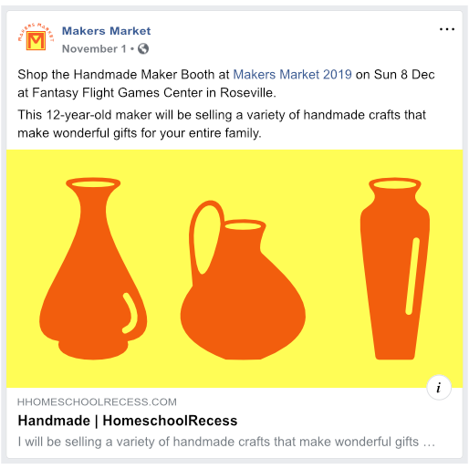
If you spend any time on Facebook, you’ve probably seen lots of posts that look like this (although you may not have known about the intentional choices that went into making it look like that):
Small square images and social media
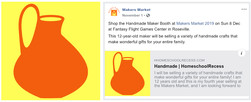
The first image you’ll be asked to upload is your square Maker Booth logo. Taking some time to tweak this image will help it look its best on social media.
To be seen by Facebook, your square booth logo must be at least 200 x 200 pixels, but (just to make things interesting), it’s important that it not be 400 x 400 pixels or larger. I recommend you make it 395 x 395 pixels, because Facebook’s image compression can make a 200x200 pixel image look unappealing.
Here’s what a 395x359 booth logo looks like when shared your Maker Booth Preview is shared to Facebook:
Large square images and social media
If your square booth logo is 400 x 400 pixels are larger, when your Maker Booth Preview is shared to Facebook, Facebook will crop it to show just the middle, which could end up looking very weird!
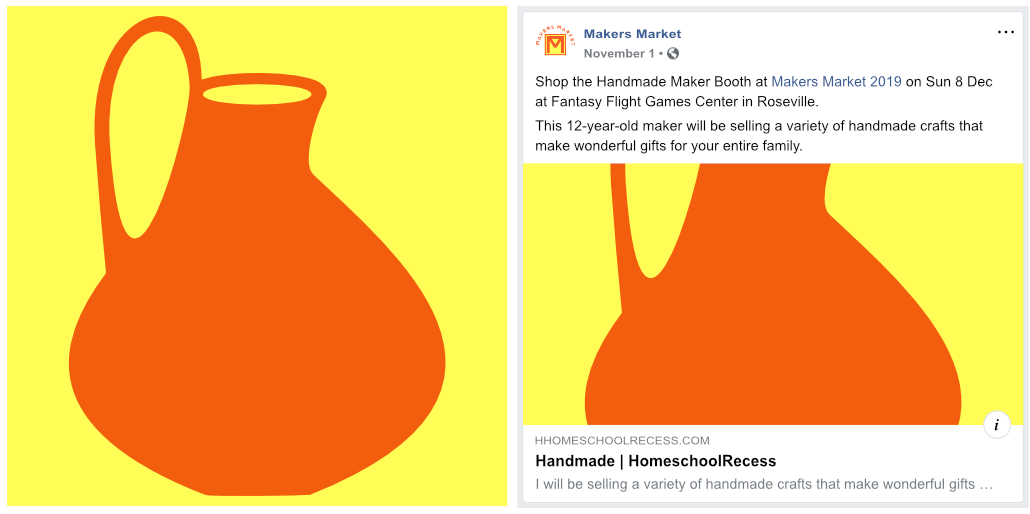
The best image size for social media
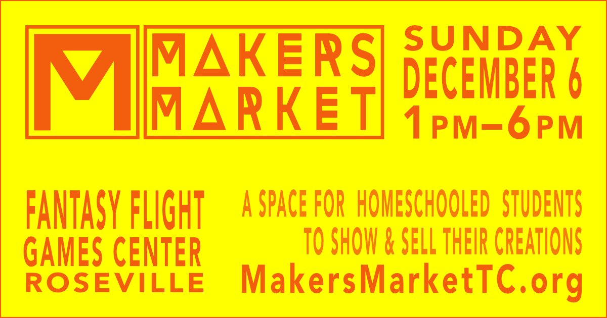
But a bigger image is better! For the best look, Facebook recommends your image be at least 1200 x 630 pixels, but you could go as small as 800 x 420 pixels. Images with this aspect ratio of 1.91:1 look the best on Facebook:

Small non-square images and social media
If your image size falls below 400 pixels on any dimension, then you’ll end up with the small square side image, and your image will cropped to the center:
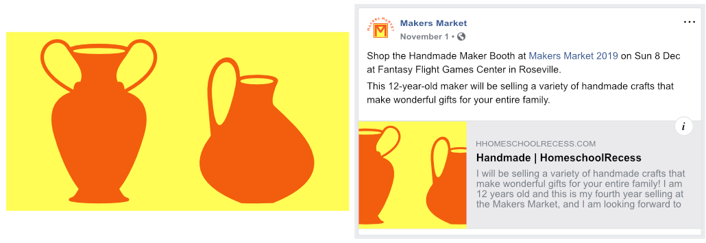
“Widescreen” images and social media
The ideal aspect ratio of 1.91:1 is fairly close to the 16:9 aspect ratio (also known as HD and as 1920×1080) and to a 2:1 aspect ratio (also known as 18:9 or univisium). If you use either of those, just be mindful of keeping important elements away from the edges as those will get cropped out:
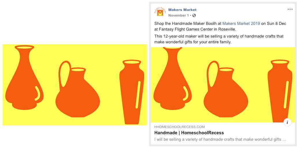
Tall (portrait) images and social media
What about portrait images? Those will get cropped, too. Here’s what happens to a 3:4 portrait image:

The best image size for social media
So, while your (correctly-sized) square logo is sufficient, for the best look on Facebook upload an image with a 1.91:1 aspect ratio (at least 800x420 pixels):
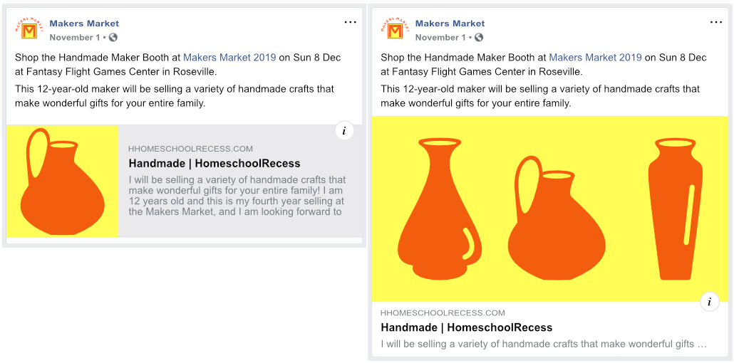
… or one that is 16:9 (at least 640×400 pixels) or 2:1 (at least 800x400 pixels) as long as you keep important elements away from the edges.
While you can choose your booth logo as your “og:image”, you’ll get a nicer looking Facebook post if you select a “widescreen” horizontal image instead.

